
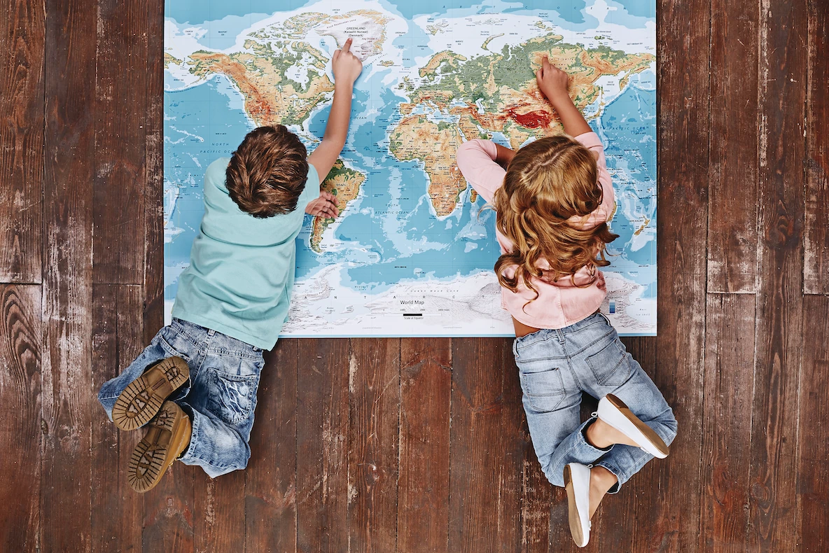
Walk into just about any classroom, and you’ll see a familiar representation of our planet hanging on the wall: a map depicting the nation-states and continents of the contemporary world in a very specific way.
Europe sits prominently at the center of the picture. To its west, North America occupies a very large piece of real estate. Greenland seems to be just as large as the entire continent of Africa.
Because we’re so young when we’re taught to see the world this way, we rarely question its accuracy, or whether there are other perspectives that are just as valid. Asking these questions leads to some revealing discoveries about why we perceive the world the way we do, and how we can correct some of the misconceptions we’ve absorbed along the way.
Meet Mercator
The map most of us grew up with goes back to the 16th century, when the Flemish cartographer Gerardus Mercator introduced his projection in 1569. His goal wasn’t to adorn a classroom wall or to help second graders rattle off the names of the countries of the world.
Like so many other things, his map was created for practical, commercial reasons. In the Age of Sail, trade was carried out largely by ships crossing the high seas. There was a growing need for maps that could help sailors navigate trade routes reliably.
The important thing to note here is that Mercator wasn’t trying to produce the most accurate picture of the world. He was simply helping sailors get from Point A to Point B without running aground or taking the long route like Odysseus did.
In the process, however, Mercator created a map that distorted the relative sizes of the continents. His image of the world became so commonplace that those distortions began to entrench themselves in popular thinking.
Drawn (Not) to Scale
The distorted nature of Mercator maps becomes instantly visible when you start comparing the areas of different regions.
In reality, the African landmass is about seven times larger than the European Union, yet the two look roughly the same size on a Mercator map. Similarly, Greenland looks enormous, even though Africa is about fourteen times larger.
These distortions occur because Mercator maps stretch land more and more the closer it is to the poles. As a result, a piece of land covering 100 square kilometers near Oslo can look four times larger than one of the same size near Nairobi.
Mercator wasn’t being intentionally dishonest when he drew up his map. There was a practical reason for his approach: straight lines on a Mercator map represent a constant compass bearing, which made maritime navigation much simpler than it had been before.
The trouble is that Mercator’s navigational map eventually came to be taken as a representation of geographical reality. Any map, for that matter, makes choices about what to show, what to center, and what to leave out. Even the most accurate maps are interpretations of the features of the Earth.
Maps and Meaning
This is where maps begin to mirror language in many ways.
The words we use and the way we put them together influence how people perceive reality. Maps do something similar, but with lines, colors, borders, and proportions. Through these choices, maps can make some places look prominent and others peripheral, some central and others marginal.
This has always been true of representations of the world. The ancient Babylonians put Babylon at the center of their map of the known world. Medieval European maps often gave certain religious sites greater importance than other locations.
Acknowledging that maps carry meaning is important. It tells us that they don’t just help us find places; they also shape how we perceive those places in relation to others. Using a map that centers one continent and makes another look much smaller than it is eventually colors how we think about those parts of the world.
Taking a New Path
We now know that the Mercator map, familiar as it is, offers just one way of seeing the world. This raises the question: are there alternatives, and how do they interpret geographical reality?
There are. To name a few:
- The Gall-Peters projection, a map that preserves relative area but significantly distorts the shapes of continents.
- The Robinson projection, which strikes a compromise between several kinds of distortion.
- The Equal Earth projection, which preserves the relative size of landmasses while keeping an overall appearance similar to familiar world maps.
Journeying With Maps
Maps are often considered authoritative in ways that other media aren’t. We’re taught to question the biases in articles or the authenticity of a photograph, but maps rarely prompt the same kind of skepticism.
Yet translating the surface of a sphere as complex as our planet into two dimensions will always involve choices. The colors, borders, and sizes are determined by the people doing the drawing.
In other words, when a map is drawn a certain way, it leads you toward certain conclusions about what it represents. Being aware of that is the first step to gaining a more accurate picture of the world we live in.
